
Mercury is Retrograde so…

One aspect, I get to tinker with web page “toys,” looking at design and function. More like function as I want as little “design” as possible. Less is more, especially between the written word and its delivery.
Less, not more(see Taurus).
I’m back to the original idea of the column itself on the front page, the whole column, then a footer with links to the last half dozen? Last three? I’m not sure.
Three, five, seven, what is a round number that’s nice, just the previous two-three weeks? Think that’s what I’ll try.
Below that, random link to specific content. Maybe.
The header menu, cut this down some more, shop, fineprint, contact, weblog (you are here).
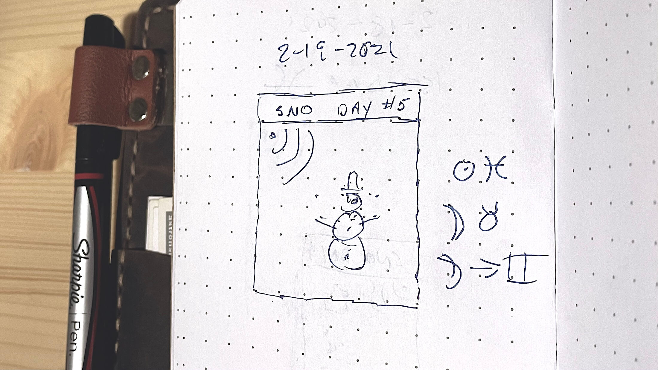
Sno day 5
The footer menu itself, search, archives, books, bio, travel, privacy policy, ToC.
Mercury is Retrograde so…
There are, to this day, bits and pieces of the original HTML code still lingering in places, buried on the site. That’s code that has stood up through a half dozen servers, then the transition from static web format to a more dynamically served, now-standards compliant issue. Style. From the lawless west, to what it is now?
One design feature that stuck with me? A single element I can’t seem to shake, if for nothing more than my own amusement? It’s the fineprint, and long before that was required by law, I had it on the site. Then, as an addendum, and snappy bit of imagery, the original concept was for a single passage from the collection of disclaimers to roll out across the top of the page, just as a reminder. Do it so the warning would change with each page reload. It’s in the footer, these days, but that tiny piece of code — with its original idea — lives on, if only to amuse me.
Mercury is Retrograde so…
The typeface is an issue, I got enamored of one, and then recently, played with others on the practice sites, but I can’t seem to nail down the exact “look” because I’m not sure what that is, something between Classical (a Times Roman family), Neo-Classical, Modern, and Post-Modern. Simple, too. Simple, and clear. At this moment, I’m thinking a (times-derivative) serifed headline with a plainer, Helvetica-style sans-serif for body copy.
Playing with them then testing a specific “font family” that was google-approved, and therefore, ubiquitous? I liked the way it rolled out on the test blog. See how long this lasts, but I like it — an average.
It’s a full-bodied typeface, but it is also slick, quite readable to my tired, old eyes. The display font just is more than functional; it has its own compelling back story: Averia Libre.
Setting it up, there was the ubiquitous figure, a letter (G) that implies it’s a Google Font, and then means universal acceptance with concomitant clarity.
Mercury is Retrograde so…
the Portable Mercury Retrograde
Portable Mercury Retrograde – Kramer Wetzel
Portable Mercury Retrograde: astrofish.net’s Mercury in Retrograde
1 Trackback or Pingback